Int Moth K3222 Project

-
bornagainmothie
- Posts: 222
- Joined: Mon Apr 23, 2012 1:28 pm
Re: Int Moth K3222 Project
Red is ok, but I was hoping for a more 70's theme for a 1972 Nationals winning boat
Psychedelia, Glam Rock, that sort of image.
I'm not thinking of wearing platform sailing boots though!
Psychedelia, Glam Rock, that sort of image.
I'm not thinking of wearing platform sailing boots though!
Re: Int Moth K3222 Project
Hi Lyndon,
Am really keen on following your project - do you mind if I steal one of your pictures - you'll get credit and a glowing mention!
Cheers
D
Am really keen on following your project - do you mind if I steal one of your pictures - you'll get credit and a glowing mention!
Cheers
D
David H
Re: Int Moth K3222 Project
IIRC typical 70s would have been a single paint colour but something extreme in the way of boat name lettering.bornagainmothie wrote:Red is ok, but I was hoping for a more 70's theme for a 1972 Nationals winning boat
OK she's not a Moth, but the style is much the same...
(There is a strong Moth connection though!)
-
bornagainmothie
- Posts: 222
- Joined: Mon Apr 23, 2012 1:28 pm
Re: Int Moth K3222 Project
No problem David, these pics were seriously reduced to fit in the forum limits, let me know which ones you want and I can email the full sizes if you want better quality.Am really keen on following your project - do you mind if I steal one of your pictures
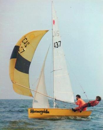
Jim, the Cherub hull shape looks very close to the Stockholm Sprite. My first Oppie was that colour too. I guess it was all down to the limited choice on the International Paints colour chart back then.
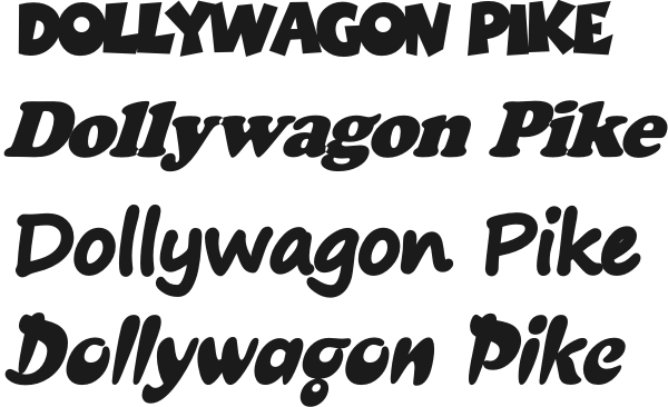
What can I do with a name like Dollywagon Pike???
Re: Int Moth K3222 Project
Oh believe me, it wasn't! Haemogoblin wasn't like *anything!*bornagainmothie wrote:the Cherub hull shape looks very close to the Stockholm Sprite.
Re: Int Moth K3222 Project
JimC wrote:Oh believe me, it wasn't! Haemogoblin wasn't like *anything!*bornagainmothie wrote:the Cherub hull shape looks very close to the Stockholm Sprite.
Oh, I should think a very bold font, text slightly condensed, maybe on these lines? Very rounded perhaps?bornagainmothie wrote:What can I do with a name like Dollywagon Pike???
-
bornagainmothie
- Posts: 222
- Joined: Mon Apr 23, 2012 1:28 pm
Re: Int Moth K3222 Project
I like that last font, so off to Woolworths to buy some sticky-back plastic 
Re: Int Moth K3222 Project
could be a quick trip. Found a nother mothie yesterday. The chap who delivered the Icon confessed to having a scow moth hidden in his shed. What with that and the one up the road I wonder how many more are lurking out there.
The Peril
Agamemnon
Lovely little Cadet
OK 1954
Xena Warrior Princess
Finn 469
Laser 2
Wayfarer World
Agamemnon
Lovely little Cadet
OK 1954
Xena Warrior Princess
Finn 469
Laser 2
Wayfarer World
Re: Int Moth K3222 Project
Another Haemogoblin:
http://www.flickr.com/photos/49055842@N02/13271055425/
We made our own fonts in them days.
http://www.flickr.com/photos/49055842@N02/13271055425/
We made our own fonts in them days.
Re: Int Moth K3222 Project
The font is called croissant or CroissantD. It came with a Corel installation, but it seems reasonably widely available as freeware.bornagainmothie wrote:I like that last font, so off to Woolworths to buy some sticky-back plastic :D
I italicised it gently and compressed the letter spacing a bit. I think if I were doing it for my boat I might alter the lower stroke of the g to be more like the y, I'm not convinced that g really works very well...
If you like pmail me an email address and I'll send you the below in a vector format.
- Attachments
-
Re: Int Moth K3222 Project
Good grief Andy... I thought I was bad for keeping stuff. You must have a very organised filing system to be able to lay your hands on that sort of thing, but honestly: if you keep *everything* like that no wonder your house started sliding down the hill [grin].
Did like that lettering for Pxy though, that was such a good looking job...
Did like that lettering for Pxy though, that was such a good looking job...